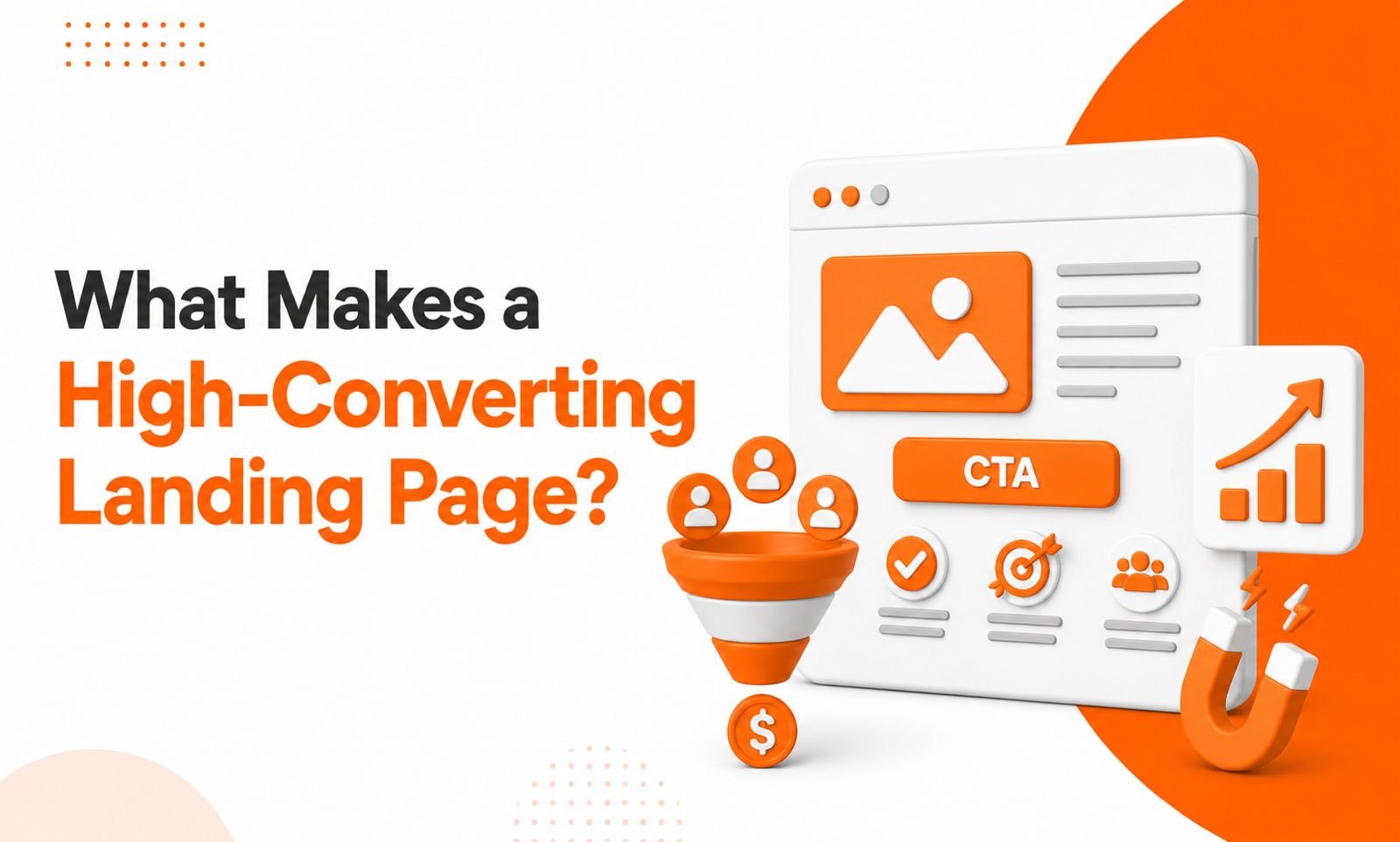
What Makes a High-Converting Landing Page?
When people click on your advertisement, email, or social media post, they expect to find exactly what they were promised. If the page is confusing, slow, or difficult to use, most visitors leave within seconds. That means lost opportunities, fewer enquiries, and lower sales.
A well-planned High Converting Landing Page helps businesses turn visitors into customers by giving them a clear message, an easy journey, and one simple action to take. Whether your goal is product sales, sign-ups, or Lead Generation, the landing page plays a major role in improving results.
Many businesses invest money in digital advertising but forget to improve the page where visitors finally land. Even a small improvement in page layout, content, or loading speed can increase conversions without increasing your marketing budget. This is why successful brands focus on CRO and user experience before spending more on traffic.
In this guide, you'll learn what makes a landing page successful, why it matters, and how you can build pages that encourage more visitors to take action.
Why Landing Pages Matter More Than Ever
A website homepage usually has many purposes. It introduces your business, shares different services, and allows visitors to explore multiple pages. A landing page is different because it focuses on one specific goal.
Instead of offering many choices, it guides visitors toward one action. This could be filling out a contact form, requesting a free consultation, downloading an ebook, or purchasing a product.
When every element supports one goal, visitors are less distracted. They understand what is being offered and why they should take action. This focused approach improves website conversions and creates a better customer journey.
Businesses that use dedicated landing pages for advertising campaigns often see better performance because the message remains consistent from the ad to the final page.
Start with a Clear Value Proposition
The first few seconds decide whether visitors stay or leave. Your headline should immediately explain what you offer and how it helps the visitor.
Avoid complicated language or marketing buzzwords. Instead, communicate the benefit in simple words that anyone can understand.
A strong value proposition answers three important questions:
- What are you offering?
- Why should someone choose you?
- What benefit will they receive?
Supporting text should explain the offer without overwhelming the reader. Every sentence should help visitors move closer to making a decision.
Simple and benefit-focused messaging creates trust and keeps visitors engaged.
Good UX Design Creates Better User Experience
Many businesses focus only on attractive colours and graphics, but UX Design is much more than appearance. It is about making every interaction smooth, simple, and frustration-free.
Visitors should instantly know where to look, what to read next, and how to complete the desired action.
A clean layout with enough white space improves readability. Short paragraphs, meaningful headings, and clear sections help visitors scan information quickly.
Navigation should be minimal because every extra option can reduce focus. The goal is not to make visitors explore the website but to encourage them to complete one specific action.
A mobile-friendly design is equally important. Today, a large percentage of users browse websites through smartphones. If your landing page doesn't display properly on smaller screens, conversions can drop significantly.
Fast loading pages, readable fonts, and responsive layouts all contribute to a positive user experience that encourages visitors to stay longer.
Build Trust Before Asking Visitors to Convert
People rarely share their contact details or make purchases unless they trust your business.
Trust is built through consistency, transparency, and proof.
Customer testimonials help visitors understand that real people have benefited from your products or services. Case studies, client logos, ratings, and success stories also increase confidence.
Displaying secure payment badges, privacy assurances, and clear contact information further reduces hesitation.
Professional design also plays a role in trust. Outdated layouts, broken images, or poor formatting can make even a good business appear unreliable.
Every section of the page should reassure visitors that they are making the right decision.
Create Strong Calls-to-Action That Stand Out
A landing page without a clear Call-to-Action is like a shop without a checkout counter.
Visitors need guidance.
Instead of using generic buttons like "Submit," choose action-oriented text that tells users exactly what they'll receive.
Examples include:
- Get Your Free Consultation
- Download the Free Guide
- Start Your Free Trial
- Request a Quote Today
The button should be easy to notice without looking aggressive. Good spacing, contrasting colours, and strategic placement make the CTA more visible.
Repeating the CTA naturally throughout the page also helps visitors take action whenever they feel ready.
Remember, every CTA should match the visitor's stage in the buying journey.
Improve Performance with CRO Strategies
CRO, or Conversion Rate Optimization, is the process of improving your landing page so that more visitors complete your desired goal.
Instead of increasing advertising spend, businesses analyse visitor behaviour and make data-driven improvements.
Small changes often produce impressive results.
Changing a headline, improving button text, reducing unnecessary form fields, or simplifying page design can increase conversion rates.
Many marketers also use A/B testing to compare two versions of the same page. By measuring real visitor behaviour, businesses can identify which version performs better.
Successful optimization isn't based on assumptions—it relies on testing, analysing, and continuously improving.
Over time, these small improvements create significant growth in overall marketing performance.
Focus on Lead Generation Instead of Just Traffic
Driving traffic to your website is important, but traffic alone doesn't grow a business.
The real objective is Lead Generation turning anonymous visitors into potential customers.
This starts by offering something valuable.
Free consultations, downloadable resources, webinars, templates, discount coupons, or product demos encourage visitors to share their information.
However, asking for too many details often reduces conversions.
Keep forms simple.
Only request the information you genuinely need at that stage of the customer journey.
A shorter form usually creates less friction and encourages more visitors to complete it.
Quality leads are far more valuable than high visitor numbers without conversions.
Common Landing Page Mistakes That Reduce Conversions
Even well-designed websites sometimes fail because of small mistakes that frustrate visitors.
A confusing headline, slow loading speed, poor mobile responsiveness, weak CTA placement, or inconsistent messaging between advertisements and landing pages can all increase bounce rates.
Another common issue is providing too much information.
Visitors don't need every detail immediately. They simply need enough information to understand your offer and feel confident about taking the next step.
Keeping the page focused, relevant, and easy to read creates a smoother conversion journey.
Measure Results and Keep Improving
Creating a landing page is not the final step. The best-performing pages are regularly reviewed and improved based on real user behaviour. Digital marketing is always changing, and visitor expectations change with it.
Track important metrics such as conversion rate, bounce rate, average time on page, form completion rate, and click-through rate. These numbers help you understand how visitors interact with your page and where they lose interest.
Analytics tools, heatmaps, and user session recordings can reveal valuable insights. For example, you may discover that visitors stop scrolling before reaching your call-to-action or abandon the form because it asks for too much information. These findings allow you to make informed improvements instead of guessing.
Regular testing also helps identify what works best. A different headline, a shorter form, or a more visible button might improve results. Small changes, when tested consistently, can have a significant impact on overall performance.
The Role of Content in Landing Page Success
Design attracts attention, but content convinces visitors to take action. Every sentence should answer a question, solve a problem, or highlight a benefit.
Instead of talking only about your business, focus on your audience's needs. Explain how your product or service solves a real challenge. Keep the language simple, direct, and easy to understand.
Avoid long blocks of text. Break information into meaningful sections with descriptive headings so readers can quickly find what they are looking for.
Using relevant keywords naturally also helps search engines understand the page without affecting readability. The goal is to write for people first while keeping search visibility in mind.
Strong content combined with a clear layout creates a smooth journey from the first headline to the final action.
Why Speed and Mobile Experience Matter
Visitors expect websites to load almost instantly. Even a delay of a few seconds can increase the chance of users leaving before they see your offer.
Optimizing images, reducing unnecessary scripts, enabling browser caching, and choosing reliable hosting all contribute to better page speed.
A fast page also improves the overall user experience and supports better search engine performance.
Mobile optimization is equally important. Most users browse websites using smartphones, so your landing page should look professional on every screen size.
Buttons should be easy to tap, text should remain readable without zooming, and forms should be simple to complete on mobile devices.
When visitors enjoy a smooth experience on both desktop and mobile, they are more likely to complete the desired action.
Align Your Landing Page with Your Marketing Campaign
One of the biggest reasons landing pages fail is a mismatch between the advertisement and the page itself.
If an ad promises a free consultation, discount, or downloadable guide, the landing page should immediately confirm that same offer. Consistency builds trust and reassures visitors that they have arrived at the right place.
Your messaging, visuals, and call-to-action should support the same objective across every marketing channel. Whether visitors come from Google Ads, social media campaigns, email marketing, or organic search, the experience should feel connected.
This consistency not only improves user satisfaction but also strengthens the overall conversion funnel.
Conclusion
A successful landing page is not built by chance. It combines clear messaging, thoughtful design, fast performance, and continuous improvement to guide visitors toward one specific goal.
Instead of trying to include everything on one page, focus on solving one problem and encouraging one action. When your content speaks directly to your audience, your design removes distractions, and your page builds trust, better results naturally follow.
For businesses looking to increase enquiries, sales, or sign-ups, investing time in landing page optimization is one of the smartest digital marketing decisions. A well-planned page can improve conversions, reduce wasted advertising spend, and create a better experience for every visitor.
If you regularly review performance, test new ideas, and refine your strategy, your landing pages will continue to deliver stronger results over time.
Blog FAQs
Frequently Asked Questions
A landing page designed to turn visitors into leads or customers through clear messaging and a strong CTA.
CRO helps improve conversion rates without increasing your advertising budget.
A simple, fast, and user-friendly design keeps visitors engaged and encourages action.
The goal is to drive one specific action, such as form submissions, sign-ups, or purchases.
Use a clear offer, build trust, and keep your form short to encourage more conversions.