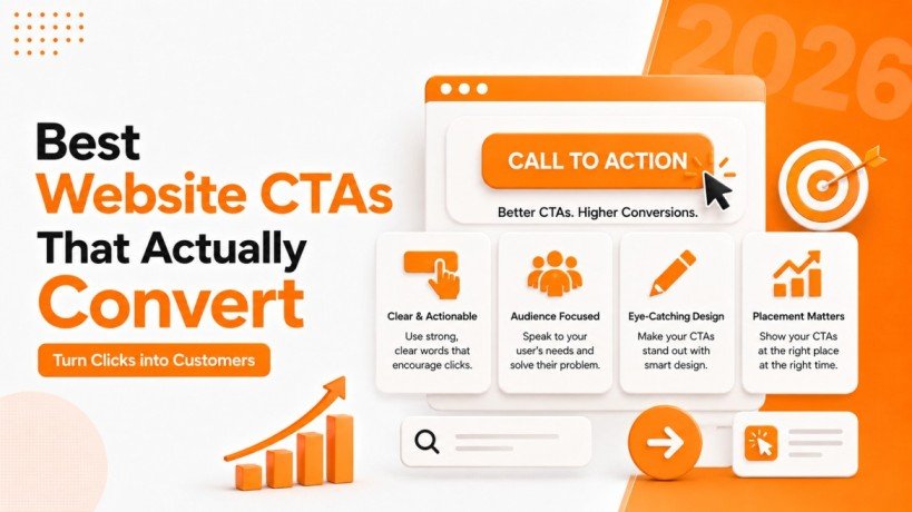
Best Website CTAs That Actually Convert
A good website does more than share information. It guides visitors toward the next step. That step could be buying a product, filling out a form, booking a service, downloading a guide, or simply learning more. This is where Website CTAs play an important role. A clear call to action tells visitors what to do next without making them think too much.
Strong Website CTAs can improve user engagement and support a better Conversion Rate. Whether you are building an e-commerce website, business website, SaaS platform, or blog, the right CTA can turn passive visitors into active users.
What Are Website CTAs?
Website CTAs, or calls to action, are buttons, links, or short messages that encourage visitors to take a specific action. Common examples include “Get Started,” “Buy Now,” “Contact Us,” “Download Guide,” and “Request a Quote.”
The best Website CTAs are simple and direct. They tell users exactly what will happen after they click. A CTA such as “Download Free Guide” gives much more information than a simple “Click Here.”
Your CTA should match the purpose of the page. For example, a product page may use “Add to Cart,” while a service page may use “Get a Free Quote.” On Landing Pages, the CTA should support the main goal of the page and avoid distracting users with too many choices.
Why Website CTAs Matter for Conversion Rate
Visitors rarely take action without a clear reason or direction. Even if your website has great content, attractive design, and useful products, users may leave if they do not know what to do next.
Effective Website CTAs create that direction. They help visitors move from one stage to another in their journey. A well-placed CTA can encourage a visitor to explore a product, contact a business, or submit information.
This can directly support your Conversion Rate. Conversion does not always mean making a sale. It can also mean getting an email signup, receiving a phone call, completing a registration, or submitting a lead form.
For example, instead of ending a service page with a paragraph, you could add a clear CTA such as “Talk to Our Team.” This gives interested visitors an easy way to continue.
Best Types of Website CTAs
Different pages need different Website CTAs. Using the same button everywhere may not give users the right motivation.
1. Get Started
“Get Started” is one of the most flexible CTA phrases. It works well for software, professional services, online platforms, and other businesses where users need to begin a process.
It sounds simple and positive without putting too much pressure on the visitor.
2. Buy Now
For e-commerce websites, “Buy Now” is a direct CTA that works well when visitors are already ready to purchase. Other options include “Shop Now,” “Order Now,” and “Add to Cart.”
The right choice depends on the stage of the customer journey. Product pages should make the buying action easy to see and understand.
3. Request a Quote
Service businesses can benefit from Website CTAs such as “Request a Quote” or “Get a Free Quote.” These buttons work especially well when customers need a price based on their requirements.
Pairing the CTA with short Lead Forms can make the process easier. Keep the form simple and ask only for information that is actually needed.
4. Download Now
Content-based businesses can use “Download Now” for ebooks, guides, reports, checklists, templates, and other useful resources.
These Website CTAs can also help businesses collect leads. A visitor may provide their name and email before receiving the resource, helping the company build a useful contact list.
5. Book a Call
“Book a Call” is useful for consultants, agencies, coaches, software companies, and professional services. It gives users a clear next step when they want personal assistance.
A CTA like “Book a Free Consultation” can work even better when the consultation genuinely has no cost.
How to Write Website CTAs That Get Attention
The words you use can have a major effect on CTA performance. Good Website CTAs focus on action and value.
Instead of using a vague phrase like “Submit,” try something more specific such as “Get My Free Quote.” Instead of “Learn More,” consider “See Our Services” when that better explains what users will find.
Strong Website CTAs often use action words such as:
- Get
- Start
- Download
- Book
- Shop
- Discover
- Try
- Request
- Join
- Contact
Keep the wording short. Visitors should understand the purpose of the CTA within a few seconds.
Place Website CTAs Where Users Can See Them
CTA placement is just as important as CTA wording. A great button may not work if users cannot find it.
The main CTA should usually appear in a visible area near the beginning of the page. This is especially important on Landing Pages, where visitors should quickly understand the offer and the next step.
You can also repeat Website CTAs naturally throughout a longer page. For example, a service page may include a CTA near the introduction, another after explaining the benefits, and a final CTA at the bottom.
However, adding too many buttons can create confusion. Give one main action priority instead of making every element compete for attention.
Website CTAs and Landing Pages
Landing Pages are often created for one specific goal, so their CTA should be closely connected to that goal.
If the page promotes a free consultation, the main CTA could be “Book My Free Consultation.” If it promotes a downloadable guide, “Get the Free Guide” may be more suitable.
The headline, supporting text, visuals, and CTA should all work together. When visitors understand the offer and see a clear next step, they are more likely to take action.
Avoid placing several unrelated Website CTAs on a focused landing page. Too many choices can make the visitor unsure about what to do.
Make Lead Forms Simple
Lead Forms are another important part of a conversion-focused website. If your CTA opens a form, the form should be easy to complete.
Asking for too many details can make visitors leave before submitting. Start with essential information such as name, email, phone number, or a short requirement field, depending on your business.
The CTA on the form should also explain the benefit. “Send” is functional, but “Get My Free Quote” gives users a clearer reason to complete the form.
Combining simple Lead Forms with strong Website CTAs can create a smoother user experience and help businesses capture more genuine leads.
Test Your Website CTAs
There is no single CTA that works perfectly for every website. What works for one audience may not work for another.
Testing different Website CTAs can help you understand what your visitors prefer. You can test button text, placement, size, surrounding copy, and even the offer itself.
For example, you could compare “Contact Us” with “Talk to an Expert” and track which version gets more clicks. You can also test whether moving a CTA higher on the page improves your Conversion Rate.
Use website analytics to monitor clicks, form submissions, purchases, and other important actions. Small changes can sometimes create meaningful improvements.
Common CTA Mistakes to Avoid
Even well-designed Website CTAs can fail when basic mistakes are made. One common problem is unclear wording. Visitors should never have to guess what happens after clicking.
Another mistake is using weak contrast or placing the CTA where it gets lost among other page elements. Poor mobile placement can also reduce clicks because many users browse websites on smartphones.
Avoid misleading CTA text as well. The action promised by the button should match the page that opens after the click. Trust is important, especially when asking users to provide information through Lead Forms.
Finally, do not use several equally important CTAs on the same section. Choose one primary action and make it easy to notice.
Final Thoughts
Effective Website CTAs guide visitors toward meaningful actions. The best ones are clear, short, useful, and connected to the purpose of the page. From “Buy Now” on product pages to “Book a Call” on service pages, the right CTA depends on what you want visitors to do.
Focus on simple wording, strong placement, mobile-friendly design, and easy Lead Forms. Use relevant CTAs on Landing Pages, track results, and test different options to improve your Conversion Rate over time.
When every page has a clear next step, your website becomes easier to use and more effective at turning visitors into customers and leads.
Blog FAQs
Frequently Asked Questions
Website CTAs are buttons or links that encourage visitors to take action, such as signing up, contacting a business, or making a purchase.
Clear Website CTAs guide users toward the next step, helping increase engagement, leads, and conversions.
Website CTAs work best above the fold, after key content sections, and near important conversion points.
An effective Website CTA uses clear wording, highlights benefits, and stands out visually on the page.
Yes, strong Website CTAs encourage users to complete Lead Forms by clearly showing the value of taking action.